Showing posts with label Digital Arts. Show all posts

Social Issue Project


 Artist Statement 

For this project, I decided to go with a topic I feel most passionate about. There are plenty of social issues out there, but when I thought about being creative with this, I wanted to do something that would allow me to explore the creative possibilities. So I decided to create my own campaign poster promoting ways to save energy and help the environment.

This poster was done on Photoshop and each image I am in shows what and what not to do in order to save energy. The images were taken with my digital camera, using self-timers, and then adding effects to enhance or darken each photo. I made sure the "do not" images were done in black and white to make them stand out in a way that is more negative and would make people refrain from doing. The lighter colored images are placed below with the green arrow and brighter colors with alternatives to save money, energy, and ultimately the environment. 

Some challenges with this project was to make sure that I followed the camera techniques. I wanted to make each image creative by providing examples of common things we do everyday, and also suggest alternatives to help the environment. Making sure I had enough space on the poster was also important in order to make all of the items fit accordingly. The slogan, "Life Starts With Earth So Let's Preserve It" is suppose to catch the viewers eyes and draw them in to this campaign poster. I really enjoyed creating this, especially since I thought about it ever since the semester began. Seeing something come to life is rewarding and also enhances creativity.

Creative-Self


Artist Statement 
 
This project was for Media Aesthetics and Creativity, and it describes my creative self in a unique way. The image has a collage of photographs showcasing what I enjoy doing, seeing, and experiencing. The details in my eyes are picking up the colors of what is surrounding me to provoke the idea of inspiration and enlightenment. My love for music, movies, fashion, travel, and nature all lend inspiration to me, and that is why I chose a combination of those things to express who I am as a creative person.

Lyrical Collage

Artist Statement

For my lyrical collage, I wanted to make the focal points the telephone cords and girl in the image. The girl is Carly Rae Jepsen who sang, Call Me Maybe. So I decided to incorporate that catchy line into the lines of cords with layers of clouds to make it seem like a dream of hers. The cords create a heart shape once they come together, because the song is about a "fling" of hers. I also wanted to keep the male/female theme going with the blue and pink phones and gradient background in a collage style. Overall, I really like the turnout and I find it complementing to my lyrical choice. 


Custom Graphic

Artist Statement

For my custom graphic I went with a mason jar pattern and also used that in different textures and transparencies to create patterns within patterns. There is a lot going on in this image, between the mason jar placed in the grass to the leaves, stars, jars, and other whimsical looking objects coming out of it. There is a lot of blurred edges to create a mystical, magical, and dream-light look. I made the entire portrait an outside scenery with the different sizes to create a 3D effect. Adding layers and gradients also enhances the overall feel of this image and creates a warm midnight magical image. 


Magazine Cover

Artist Statement

For my Photoshop magazine I decided to go with something that I'm interested in so I that I could really play around with it. I have a background in fashion magazine internships, so I knew how I wanted my basic layout to be and the focal points. For this magazine I entitled it, W.W.W. Magazine which stands for who, what, and where or triple W for short. This magazine captures all the latest trends, fashions, beauty products, lifestyles, and national/global news. This magazine encompasses the ins & outs of fashion and what the industry has to offer in an up-scale way. Along with the concept, I wanted to create a look that makes this magazine stand apart, by staying within the same neutral color scheme and making my photograph the focal point it added a neat theme. I had fun playing around with all the different textures, shapes, fonts, and gradients to enhance the overall feel of this magazine. Enjoy


Self Insertion

Artist Statement

I inserted myself sitting on a stone at Stonehenge by using the Photoshop quick selection tool and lasso tools. It was a tedious task to get all the edges smooth and natural looking, and then to match the saturation and contrast of the photograph. I enjoyed playing around with the images and finding a balance to them and luckily both of my pictures chosen were outside. Enjoy!  


HTML5

  Artist Statement

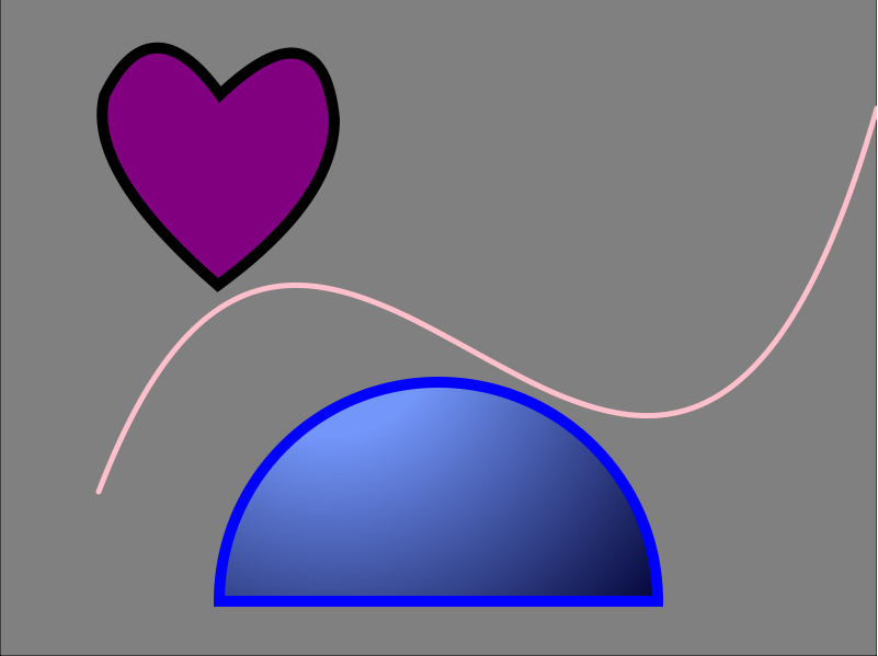
 After many hours in the lab, copious amounts of images, I have finally finished this assignment. I ended up going with a fun mixture of shapes and incorporated different colors and sizes to make each one unique. I found some ways of coding easier than others, but I primarily stuck to the lessons we learned in class. I played around with bezier and quadratic curves and enjoyed testing out different line widths and colors to make each shape stand apart from the next. Below is a screenshot of the image and the code used.


<!DOCTYPE HTML>
<html>
<head>
<script>
window.onload = function() {
var canvas = document.getElementById("myCanvas");
var context = canvas.getContext("2d");

////////////////////////////////////// start below this line ˇˇˇˇˇˇˇˇˇˇ

//background// 
var x = 0;
var y = 0;
var width = 800;
var height = 600;

context.beginPath();
context.rect(x, y, width, height);
context.fillStyle = 'gray';
context.fill();
context.stroke();

//heart shape// 

context.beginPath();
context.lineCap = "round";
context.lineWidth = 20;
context.strokeStyle = 'black';
context.fillStyle = 'purple';
context.moveTo(100, 90);
context.quadraticCurveTo(85, 155, 199, 255);
context.quadraticCurveTo(300, 180, 300, 110);
context.quadraticCurveTo(290, 7, 200, 95);
context.quadraticCurveTo(140, 7, 100, 90);
context.stroke();
context.fill();

//semi circle//

var centerx = 400;
var centery = 550;
var radius = 200;

var startx = 300;
var starty = 300;
var startradius = 100;
var endx = 300;
var endy = 300;
var endradius = 400;

context.beginPath();
context.arc(centerx, centery, radius, 0, Math.PI, true);
context.closePath();
var grd = context.createRadialGradient(startx, starty, startradius, endx, endy, endradius);
grd.addColorStop(0, 'rgb(115, 150, 250)');
grd.addColorStop(1, 'rgb(0, 0, 50)');
context.fillStyle = grd;
context.lineWidth = 10;
context.strokeStyle = 'blue';
context.fill();
context.stroke();

//curve//

var x2 = 100;
var y2 = 450;
var controlx2 = 300;
var controly2 = -100;
var controlx3 = 600;
var controly3 = 800;
var endx2 = 800;
var endy2 = 100;


context.beginPath();
context.moveTo(x2, y2);
context.bezierCurveTo(controlx2, controly2, controlx3, controly3, endx2, endy2);
context.lineWidth = 5;
context.strokeStyle = 'pink';
context.stroke();

////////////////////////////////////// end above this line ˆˆˆˆˆˆˆˆˆˆˆˆˆˆˆ

};

</script>
</head>
<body>
<canvas id="myCanvas" width="800" height="600"></canvas>
</body>
</html>

Vector Illustration


Artist Statement 
 
I chose a Chanel ad for my vector illustration. I liked the colors used in this original photo and the angle of the models face. I had fun with this project. I tweaked some parts to make them more full and bold with contrast and color. I also took the Chanel logo itself off and only kept the lipstick bottle as the product being advertised. I like how the use of gradients and different line tools helped enhance the real life feel and also to create more depth and texture. Enjoy!

Exquisite Corpse


Artist Statement

My exquisite corpse is called Gertrude and this is a fancy fish dressed up in a tuxedo with half of its body outside of the ocean. Gertrude is going out for the night, and the image is displaying more evening time with the colours a tad bit darker. There are light hues coming in from the right hand side of the image. The colours chosen here are to help define the outfit and also accentuate the details of the fish. All of the markings were made to create a more realistic fish texture, even though this is still more cartoon-like with the bold colours and overall design. Enjoy! 


Logo Project

~My Logo Process~


 Step one:

 This was the most creative step of the process because it allowed me to let all my ideas come together. I found multiple ways of translating my brand idea into an actual logo. This step also helped me figure out what direction I wanted to head. The product is great for both males and females so the logo itself had to reflect that.

Step two:

This step was where I had to refine my final selection of a logo.This was the fun point because I got to add in all the little details and start making the entire logo reflect my product.

Step three:


Here was the last step of the logo completion. The spin-off of "foodie" is now "Winie" for all those wine connoisseurs. This point was a bit more technical because it is a very tedious task. The target audience is still for men and women and the color reflects red wine with the accented bubbles at the end of the writing. The cork was also added to make the concept more complete along with the wine glass being filled up. The overall look and feel to this logo is more natural with the cursive writing which creates a sense of motion and it also has a very organic touch to it as well. I think this will target my wine-consuming audience and it makes sense aesthetically. Hope you like it!

Caligramme in Apollinaire's Way:


Here is a screen shot of my caligramme of Marilyn Monroe


Artist Statement


The making of this caligramme was very time-consuming. It was fun to see the whole image come together with just words, but also frustrating to make all those words legible to read. My mission was to make this classic face visible through the writing and also give different textures and shapes to enhance the overall design of this caligramme. The words within this design pertain to Marilyn Monroe's life including her accolades and some fun facts about her life.  Enjoy! 


Logo Critiques


This company is a Japanese tech company started in 1912 and has over fifty thousand employees worldwide. The name Sharp came from one of their first inventions called Even-Sharp which is the mechanical pencil. The logo's target audience would be anyone interested in technology, mechanics, and electronics. The logo at first seems pretty bland, yet bold and straight forward. This look may have come from the fact that this tech company is very renown, strong, and powerful. The red sort of symbolizes strength and power while the font is very direct and clear. This logo is clean and easy to read, and I believe that is why it is so catchy and recognizable.


The brand Scotch is part of 3M manufactures and is a widely known transparent adhesive tape brand. The most commonly seen label is the one featured above. This logo is very bold and the two contrasting colors is what makes it stand out the most. The use of the term Scotch in the name was a pejorative meaning "stingy" in the 1920s and 1930s. I think the whole image of this logo and the product it represents makes a lot of sense and works well. It is catchy and also a widely used product for anyone so that gives its name more credibility as well.


Brother Industries is a Japanese electronics and electrical equipment manufacturer. They use the moto "at your side" underneath their logo as a trusting sign they can get the job done. This company is known for providing fax machines, copiers, printers, sewing machines and more. There was not much to find as far as the name and where it stems from, but it is easy to see the use of color and font is what makes this logo stand apart. The connected letters gives this logo some movement while the navy blue represents compassion, loyalty, and emotion. This brand also uses the motto or slogan to solidify the idea of being a trusted company.


This company tries to reach an audience of dairy consumers. Based out of the UK Müller sells yogurt, milk,  rice and cream products nationwide. This name came from Ludwig Müller when the business started in 1896 it has grown since then just through popular demand, but the name and style remains the same. This seems like a trusted brand for consumers and one that keeps its heritage in the name itself without using dairy as the focal point. The bold, outlined red helps make the name pop and standout from the white lettering. The style and layout is catchy and keeps its iconic shape and form.


This commonly known logo is Starbucks Coffee and is widely received as the most popular brand in the world. This brand started brewing for coffee fans and then latte, frappuccino, and cappuccino fans. They have expanded into various foods and snacks and other refreshing drinks as well. This company started in 1971 by three colleagues who wanted to create and sell high-quality coffee beans and equipment. The unique logo itself came from the idea of Pequod, which was a fictitious 19th century Nantucket whaleship out of the novel Moby-Dick. This mermaid looking creature would resemble the sea creature that it mysterious and beautiful. The idea stuck with the brand and it was given a natural green look with a black background. The wavy lines and bold writing is what makes this circular logo stand out. The three colors also work well together, they do not clash or overlap, each color is well defined and the image itself is easy to see. This logo is more detailed which gives a sense of thoughtful consideration when creating this type of business.


Brainstorming...

Five ideas for products and companies:


1. Healthy vending machines- they can be accessed in any commercial development or corporate business. This vending machine with logo will be iconic, bold, and incorporate fruits and veggies into the name. The name could be "Healthy Vendi" and there can be an application portion as well. The machine will offer fresh drinks and on-the-go snacks. The labeling and marketing would consist of print ads and billboards to generate  more publicity. There can also be food and drinks from established food companies and they will make a percentage off of each item sold.

2. Wine bathtub holder- this item will be called "Winie" a spin-off of "foodie" and this versatile stick-on surface will support the amount of one glass of wine. Allowing the consumer to comfortably drink wine while taking a bubble bath. The box the item is contained in will have the colored logo and its name, while the holder itself will come in basic colors and have a more simplistic logo.

3. Direct toll application- this application works directly from your cell phone device and allows the user to create an account that acts as a speed pass or Sun pass for every toll booth on the interstate. The application would have GPS capability and be able to accept every toll in every state of the U.S. This app will come with a fun and catchy logo one that is more sophisticated and minimal. The phone would have to be visible on the driver's dashboard while approaching each toll.

4. Clothing scanner- find similar styles and prices on the item selected. You would access this application through your cell phone and then it allows you to snap a picture of the tag on a piece of merchandise and then searches for similar products. This allows you to know if there are any websites that have a similar product for a comparable price. This app will have a logo that ties fashion and price tags together, and it could be marketable for people who are out shopping, this excludes grocery stores.

5. A step-tracker for pets- this step-tracker is used for pets who have to lose weight. This product will be like a collar for dogs and could be used for cats if they walk too! This product will track how many steps the animal takes. The logo or this product along with the name could be "Pet Path" and it will have two little pet paw prints underneath the name. Each collar will come in a different color and be adjustable.

Greetings!

  Hello, my name is Norissa Morse and I am currently a senior attending the University of Tampa. I have a passion for communication and public relations. I hope to gain more knowledge about digital arts through this course and use that in my professional career. I love designing, creating, and seeing artwork come to life as well as combining those creative skills with my interest in public relations and image consulting. Aside from being a full-time student, I work as a freelance publicist for a clothing designer, and have had other internship opportunities that inspired me to pursue social media, print/digital arts, and image management. Previously interning at Hearst Corporation for Seventeen Magazine was a hands-on experience which allowed me to partake in creative design ideas and digital imaging for photo shoots and product placement. On my spare time I enjoy practicing yoga, blogging, running, and reading. I'm a foodie and always inspired by Pinterest and travel!