Prosopagnosia


Artist Statement

This documentary captures a women's life living with a condition called prosopagnosia, also known as face-blindness. Her condition is very rare, yet unique to her. Following her story as she discovered this condition was so heart-felt and remarkable.
Please enjoy!

The Meaning of Creativity


Artist Statement

This documentary was for my Media Aesthetics and Creativity class. The goal for this short film was to go on a quest to find the meaning of creativity. By exploring our campus to ask students and faculty their opinions, we came up with some neat feedback. Most of their opinions were unique to them and really shares who they are. This 6 minute documentary focuses on what we have learned throughout the class about creativity, the process, and what it means. Enjoy!

Commercial Animation


Artist Statement

For my final animation, I went with a commercial promoting my product: 
This commercial uses Illustrator animation to create the bubble bath cartoon that winks towards the end. And the rest was done using Photoshop timeline to put each shot in order to sell the product. Combining bubble baths and wine creates the product Winie, and makes the viewer want this product because of the function it serves and how convenient it is. This short 22 second commercial was fun to make and to see come together. Enjoy! 

Social Issue Project


 Artist Statement 

For this project, I decided to go with a topic I feel most passionate about. There are plenty of social issues out there, but when I thought about being creative with this, I wanted to do something that would allow me to explore the creative possibilities. So I decided to create my own campaign poster promoting ways to save energy and help the environment.

This poster was done on Photoshop and each image I am in shows what and what not to do in order to save energy. The images were taken with my digital camera, using self-timers, and then adding effects to enhance or darken each photo. I made sure the "do not" images were done in black and white to make them stand out in a way that is more negative and would make people refrain from doing. The lighter colored images are placed below with the green arrow and brighter colors with alternatives to save money, energy, and ultimately the environment. 

Some challenges with this project was to make sure that I followed the camera techniques. I wanted to make each image creative by providing examples of common things we do everyday, and also suggest alternatives to help the environment. Making sure I had enough space on the poster was also important in order to make all of the items fit accordingly. The slogan, "Life Starts With Earth So Let's Preserve It" is suppose to catch the viewers eyes and draw them in to this campaign poster. I really enjoyed creating this, especially since I thought about it ever since the semester began. Seeing something come to life is rewarding and also enhances creativity.

Storyboard & Animatic


Artist Statement 

For my storyboard I went with 10 shots as separate clips. The video will show how each shot was broken down to create a flowing story. I wanted to entice the viewer by having bold, catchy wording that begins to sell the product. By the end of the clips, you will see what the product is, how it is used, and why it is a essential for any Winie to have. This was done using Premiere, and for the final version I will be using Photoshop. Enjoy!


Summer Sky

Artist Statement

This photography was taken in the summertime in Maine. It was taken as a panoramic view and captures part of the land and sea in Biddeford pool. This colorful trap was the focal point and creates a lot of depth in the picture. This was one of the most beautiful, clear days of the summer, I love how this picture captures the sandy beach, the bright sky, ocean waves, and the homes along the shore. It really is an engaging photograph.

Photography Project

Artist Statement 
This was one of my favorite projects for my Media Aesthetics and Creativity class. I took this photography with an iPhone 5s and was able to capture the most detailed and unique picture. The rule of thirds was a major consideration while taking this picture, and so was the filter setting. After settling with the Noir + Sepia filter, it drastically enhanced the photograph and almost creates this eerie or ominous feel. This picture engages the viewer by its dynamic structure and detailed leaves surrounding the frame. This minaret is part of Plant Hall at the University of Tamp.

Creative-Self


Artist Statement 
 
This project was for Media Aesthetics and Creativity, and it describes my creative self in a unique way. The image has a collage of photographs showcasing what I enjoy doing, seeing, and experiencing. The details in my eyes are picking up the colors of what is surrounding me to provoke the idea of inspiration and enlightenment. My love for music, movies, fashion, travel, and nature all lend inspiration to me, and that is why I chose a combination of those things to express who I am as a creative person.

Dream-Inspired Project


Artist Statement

For this Media Aesthetics and Creativity class project, I decided to create an image of a reoccurring dream. Using magazine pages, I layered on each piece of paper to create the overall image and look of a beach. I added two travelers passing by gazing at the large blue sky and vibrant sun. The details in each piece of paper adds texture and value to a 2-D image. I wanted to go for a surreal look by exaggerating the size of ordinary objects.  This piece is eye catching and captures the feeling I had when having this beach exploration dream!

Welcome!


Thanks for checking out my digital arts portfolio! My collection of work was done throughout my time in college and each piece has its own meaning. Exploring my gallery you will see a variety of work I have created through Photoshop, Illustrator, Premiere, and by hand. I hope you enjoy each piece as much as I do!


Feel free to check out my lifestyle and fashion blog,
 by clicking on the Norissa Lee tab!

Contact


Social Media:

http://instidy.com/missnorissalee

https://www.linkedin.com/profile/view?id=281650017&trk=nav_responsive_tab_profile


https://twitter.com/NorissaLee


https://www.pinterest.com/norissaleem/


https://plus.google.com/

Lyrical Collage

Artist Statement

For my lyrical collage, I wanted to make the focal points the telephone cords and girl in the image. The girl is Carly Rae Jepsen who sang, Call Me Maybe. So I decided to incorporate that catchy line into the lines of cords with layers of clouds to make it seem like a dream of hers. The cords create a heart shape once they come together, because the song is about a "fling" of hers. I also wanted to keep the male/female theme going with the blue and pink phones and gradient background in a collage style. Overall, I really like the turnout and I find it complementing to my lyrical choice. 


Custom Graphic

Artist Statement

For my custom graphic I went with a mason jar pattern and also used that in different textures and transparencies to create patterns within patterns. There is a lot going on in this image, between the mason jar placed in the grass to the leaves, stars, jars, and other whimsical looking objects coming out of it. There is a lot of blurred edges to create a mystical, magical, and dream-light look. I made the entire portrait an outside scenery with the different sizes to create a 3D effect. Adding layers and gradients also enhances the overall feel of this image and creates a warm midnight magical image. 


Magazine Cover

Artist Statement

For my Photoshop magazine I decided to go with something that I'm interested in so I that I could really play around with it. I have a background in fashion magazine internships, so I knew how I wanted my basic layout to be and the focal points. For this magazine I entitled it, W.W.W. Magazine which stands for who, what, and where or triple W for short. This magazine captures all the latest trends, fashions, beauty products, lifestyles, and national/global news. This magazine encompasses the ins & outs of fashion and what the industry has to offer in an up-scale way. Along with the concept, I wanted to create a look that makes this magazine stand apart, by staying within the same neutral color scheme and making my photograph the focal point it added a neat theme. I had fun playing around with all the different textures, shapes, fonts, and gradients to enhance the overall feel of this magazine. Enjoy


Self Insertion

Artist Statement

I inserted myself sitting on a stone at Stonehenge by using the Photoshop quick selection tool and lasso tools. It was a tedious task to get all the edges smooth and natural looking, and then to match the saturation and contrast of the photograph. I enjoyed playing around with the images and finding a balance to them and luckily both of my pictures chosen were outside. Enjoy!  


HTML5

  Artist Statement

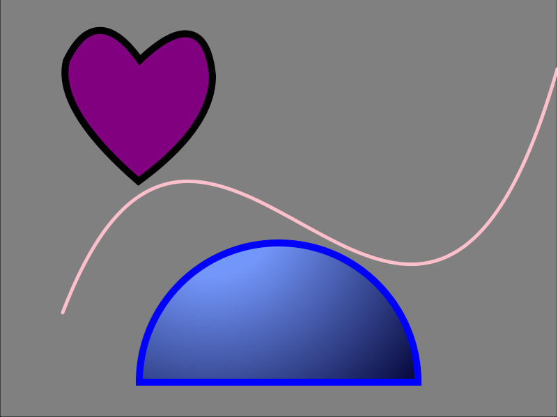
 After many hours in the lab, copious amounts of images, I have finally finished this assignment. I ended up going with a fun mixture of shapes and incorporated different colors and sizes to make each one unique. I found some ways of coding easier than others, but I primarily stuck to the lessons we learned in class. I played around with bezier and quadratic curves and enjoyed testing out different line widths and colors to make each shape stand apart from the next. Below is a screenshot of the image and the code used.


<!DOCTYPE HTML>
<html>
<head>
<script>
window.onload = function() {
var canvas = document.getElementById("myCanvas");
var context = canvas.getContext("2d");

////////////////////////////////////// start below this line ˇˇˇˇˇˇˇˇˇˇ

//background// 
var x = 0;
var y = 0;
var width = 800;
var height = 600;

context.beginPath();
context.rect(x, y, width, height);
context.fillStyle = 'gray';
context.fill();
context.stroke();

//heart shape// 

context.beginPath();
context.lineCap = "round";
context.lineWidth = 20;
context.strokeStyle = 'black';
context.fillStyle = 'purple';
context.moveTo(100, 90);
context.quadraticCurveTo(85, 155, 199, 255);
context.quadraticCurveTo(300, 180, 300, 110);
context.quadraticCurveTo(290, 7, 200, 95);
context.quadraticCurveTo(140, 7, 100, 90);
context.stroke();
context.fill();

//semi circle//

var centerx = 400;
var centery = 550;
var radius = 200;

var startx = 300;
var starty = 300;
var startradius = 100;
var endx = 300;
var endy = 300;
var endradius = 400;

context.beginPath();
context.arc(centerx, centery, radius, 0, Math.PI, true);
context.closePath();
var grd = context.createRadialGradient(startx, starty, startradius, endx, endy, endradius);
grd.addColorStop(0, 'rgb(115, 150, 250)');
grd.addColorStop(1, 'rgb(0, 0, 50)');
context.fillStyle = grd;
context.lineWidth = 10;
context.strokeStyle = 'blue';
context.fill();
context.stroke();

//curve//

var x2 = 100;
var y2 = 450;
var controlx2 = 300;
var controly2 = -100;
var controlx3 = 600;
var controly3 = 800;
var endx2 = 800;
var endy2 = 100;


context.beginPath();
context.moveTo(x2, y2);
context.bezierCurveTo(controlx2, controly2, controlx3, controly3, endx2, endy2);
context.lineWidth = 5;
context.strokeStyle = 'pink';
context.stroke();

////////////////////////////////////// end above this line ˆˆˆˆˆˆˆˆˆˆˆˆˆˆˆ

};

</script>
</head>
<body>
<canvas id="myCanvas" width="800" height="600"></canvas>
</body>
</html>

Vector Illustration


Artist Statement 
 
I chose a Chanel ad for my vector illustration. I liked the colors used in this original photo and the angle of the models face. I had fun with this project. I tweaked some parts to make them more full and bold with contrast and color. I also took the Chanel logo itself off and only kept the lipstick bottle as the product being advertised. I like how the use of gradients and different line tools helped enhance the real life feel and also to create more depth and texture. Enjoy!

Exquisite Corpse


Artist Statement

My exquisite corpse is called Gertrude and this is a fancy fish dressed up in a tuxedo with half of its body outside of the ocean. Gertrude is going out for the night, and the image is displaying more evening time with the colours a tad bit darker. There are light hues coming in from the right hand side of the image. The colours chosen here are to help define the outfit and also accentuate the details of the fish. All of the markings were made to create a more realistic fish texture, even though this is still more cartoon-like with the bold colours and overall design. Enjoy! 


Logo Project

~My Logo Process~


 Step one:

 This was the most creative step of the process because it allowed me to let all my ideas come together. I found multiple ways of translating my brand idea into an actual logo. This step also helped me figure out what direction I wanted to head. The product is great for both males and females so the logo itself had to reflect that.

Step two:

This step was where I had to refine my final selection of a logo.This was the fun point because I got to add in all the little details and start making the entire logo reflect my product.

Step three:


Here was the last step of the logo completion. The spin-off of "foodie" is now "Winie" for all those wine connoisseurs. This point was a bit more technical because it is a very tedious task. The target audience is still for men and women and the color reflects red wine with the accented bubbles at the end of the writing. The cork was also added to make the concept more complete along with the wine glass being filled up. The overall look and feel to this logo is more natural with the cursive writing which creates a sense of motion and it also has a very organic touch to it as well. I think this will target my wine-consuming audience and it makes sense aesthetically. Hope you like it!

Caligramme in Apollinaire's Way:


Here is a screen shot of my caligramme of Marilyn Monroe


Artist Statement


The making of this caligramme was very time-consuming. It was fun to see the whole image come together with just words, but also frustrating to make all those words legible to read. My mission was to make this classic face visible through the writing and also give different textures and shapes to enhance the overall design of this caligramme. The words within this design pertain to Marilyn Monroe's life including her accolades and some fun facts about her life.  Enjoy!